 SIGs | Design Guideline

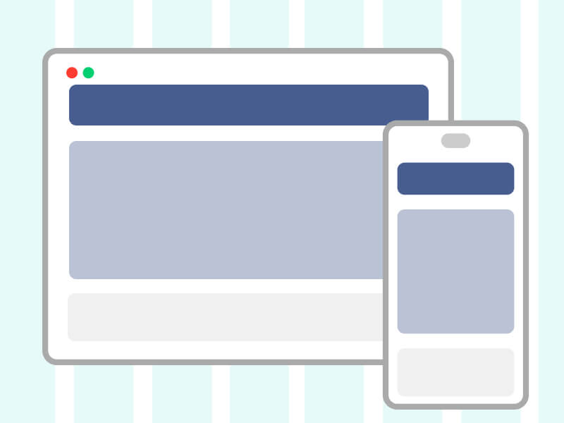
Layout
Our website layout is carefully crafted based on the Bootstrap guidelines, ensuring a responsive and mobile-first design.
By leveraging Bootstrap's powerful layout system, we have created a seamless and intuitive user experience across all devices.
Breakpoint
We adopt the Bootstrap guideline and define the device as follows:
| Mobile | Tablet | Deaktop | |
|---|---|---|---|
| Bootstrap Breakpoint | Extra Small | Medium | XX-Large |
| Dimensions | <576px | ≥768px | ≥1400px |
| Container | 100% | 720px | 1320px |
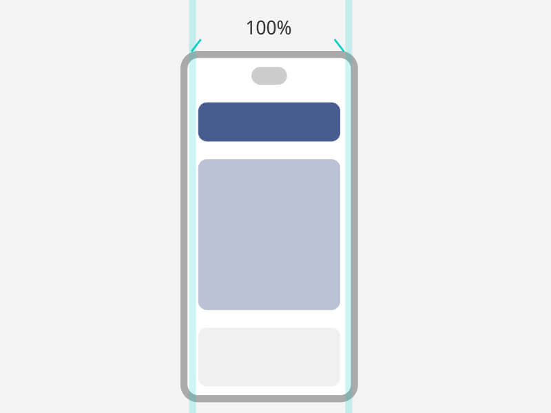
Container: 100%
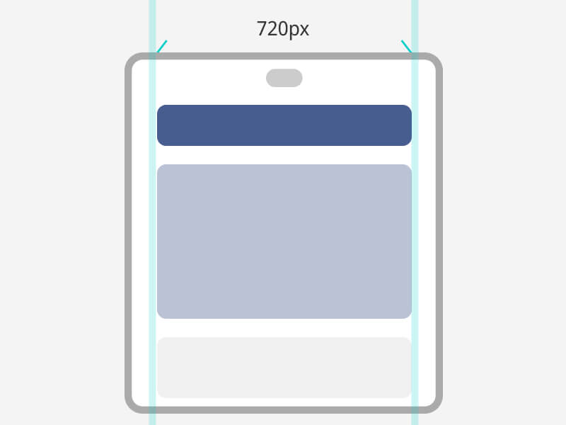
Container: 720px
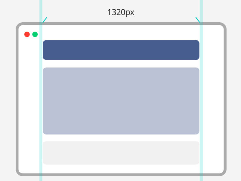
Container: 1320px
Learn more about Bootstrap Breakpoint & Container
Header
The header is fixed at the top of the page layout and will remain visible when the page is scrolled. Allow users to access the navigation bar more easily.
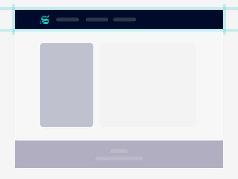
Height: 65px
Height: 65px
Height: 65px
Side Menu
The side menu is used when operating pages with more diverse units to assist users in finding the corresponding page. For example, member center pages.
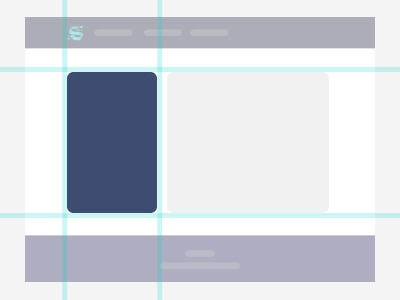
Height: Auto Flow
Height: Auto Flow
Height: Auto Flow
Footer
The footer is at the bottom of the page, including social media, policy links and copyright claim.
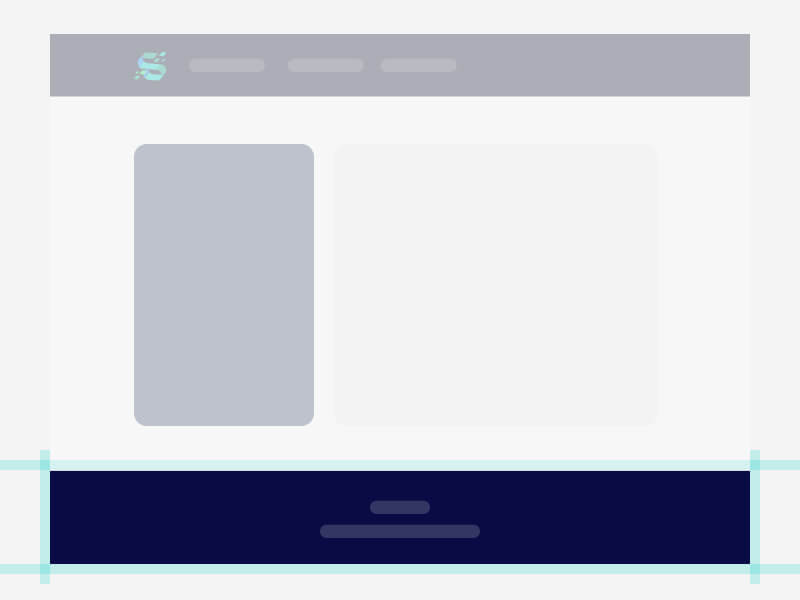
Height: Auto Flow
Height: Auto Flow
Height: Auto Flow