 SIGs | Design Guideline

Component
Our website's components are based on Bootstrap's framework, with custom adjustments and fine-tuning to better suit our specific design and functionality needs. These tailored modifications ensure a seamless user experience while maintaining the flexibility and responsiveness that Bootstrap is known for.
Navigation
Height: 65px
Backgorund: #000C27
Item color: #FFFFFF
Item color (Hover): #01CFC8
Item text size: 15px
Sample Code
<header class="header">
    <div class="header-logo">
    <a href="#">
        <img src="img/logo.svg" alt="" class="logo-img" />
    </a>
    </div>

    <nav class="header-nav">
        <a href="#">Item 1</a>
        <a href="#">Item 2</a>
    </nav>

    <div class="header-icons">
        <button class="icon-button">
            <svg
            xmlns="http://www.w3.org/2000/svg"
            width="20"
            height="20"
            viewBox="0 0 24 24"
            fill="none"
            stroke="currentColor"
            stroke-width="2"
            stroke-linecap="round"
            stroke-linejoin="round"
            data-v-inspector=""
            class="tabler-icon tabler-icon-search"
            >
            <path d="M10 10m-7 0a7 7 0 1 0 14 0a7 7 0 1 0 -14 0"></path>
            <path d="M21 21l-6 -6"></path>
            </svg>
        </button>
        <div class="user-dropdown">
            <button class="icon-button">
            <svg
                xmlns="http://www.w3.org/2000/svg"
                width="20"
                height="20"
                viewBox="0 0 24 24"
                fill="none"
                stroke="currentColor"
                stroke-width="2"
                stroke-linecap="round"
                stroke-linejoin="round"
                data-v-inspector=""
                class="tabler-icon tabler-icon-user"
            >
                <path d="M8 7a4 4 0 1 0 8 0a4 4 0 0 0 -8 0"></path>
                <path d="M6 21v-2a4 4 0 0 1 4 -4h4a4 4 0 0 1 4 4v2"></path>
            </svg>
            </button>
            <div class="dropdown-content">
                <a href="#">Item 1</a>
                <a href="#">Item 2</a>
            </div>
        </div>
        <a href="#">
            <button class="icon-button">
                <svg
                    xmlns="http://www.w3.org/2000/svg"
                    width="20"
                    height="20"
                    viewBox="0 0 24 24"
                    fill="none"
                    stroke="currentColor"
                    stroke-width="2"
                    stroke-linecap="round"
                    stroke-linejoin="round"
                    data-v-inspector=""
                    class="tabler-icon tabler-icon-heart"
                >
                    <path
                    d="M19.5 12.572l-7.5 7.428l-7.5 -7.428a5 5 0 1 1 7.5 -6.566a5 5 0 1 1 7.5 6.572"
                    ></path>
                </svg>
            </button>
        </a>
        <div class="language-dropdown">
            <button class="icon-button">
            <svg
                xmlns="http://www.w3.org/2000/svg"
                width="20"
                height="20"
                viewBox="0 0 24 24"
                fill="none"
                stroke="currentColor"
                stroke-width="2"
                stroke-linecap="round"
                stroke-linejoin="round"
                data-v-inspector=""
                class="tabler-icon tabler-icon-language"
            >
                <path d="M4 5h7"></path>
                <path d="M9 3v2c0 4.418 -2.239 8 -5 8"></path>
                <path d="M5 9c0 2.144 2.952 3.908 6.7 4"></path>
                <path d="M12 20l4 -9l4 9"></path>
                <path d="M19.1 18h-6.2"></path>
            </svg>
            </button>
            <div class="dropdown-content-lan">
            <a class="language-option" data-lang="en" href="#">English</a>
            <a class="language-option" data-lang="zh-hant" href="#">繁體中文</a>
            </div>
        </div>
        <a href="#">
            <button class="signup-button">List Product</button>
        </a>
    </div>
</header>

<!-- Mobile Menu Start -->
<button class="phone-header-button" id="phone-header-button">
    <svg
    xmlns="http://www.w3.org/2000/svg"
    width="24"
    height="24"
    viewBox="0 0 24 24"
    fill="none"
    stroke="currentColor"
    stroke-width="2"
    stroke-linecap="round"
    stroke-linejoin="round"
    class="tabler-icon tabler-icon-menu fg:white size:1.25em mx:auto"
    >
    <path d="M4 8l16 0"></path>
    <path d="M4 16l16 0"></path>
    </svg>
</button>
<div class="phone-header-container" id="offcanvasExample">
    <div class="phone-header-main">
        <a class="phone-header-subtitle" href="#">Item 1</a>
        <a class="phone-header-subtitle" href="#">Item 2</a>
        <a href="#"><button class="signup-button2">List Product</button></a>
    </div>
    <footer class="phone-header-footer">
        <a href="#" class="phone-header-footer-item">
            <svg
            width="24"
            height="24"
            viewBox="0 0 24 24"
            fill="none"
            xmlns="http://www.w3.org/2000/svg"
            >
            <path
                d="M21 21L15 15M17 10C17 13.866 13.866 17 10 17C6.13401 17 3 13.866 3 10C3 6.13401 6.13401 3 10 3C13.866 3 17 6.13401 17 10Z"
                stroke="white"
                stroke-width="2"
                stroke-linecap="round"
                stroke-linejoin="round"
            ></path>
            </svg>
        </a>

        <a href="#" class="phone-header-footer-item">
            <svg
            width="24"
            height="24"
            viewBox="0 0 24 24"
            fill="none"
            xmlns="http://www.w3.org/2000/svg"
            >
            <path
                d="M16 7C16 9.20914 14.2091 11 12 11C9.79086 11 8 9.20914 8 7C8 4.79086 9.79086 3 12 3C14.2091 3 16 4.79086 16 7Z"
                stroke="white"
                stroke-width="2"
                stroke-linecap="round"
                stroke-linejoin="round"
            ></path>
            <path
                d="M12 14C8.13401 14 5 17.134 5 21H19C19 17.134 15.866 14 12 14Z"
                stroke="white"
                stroke-width="2"
                stroke-linecap="round"
                stroke-linejoin="round"
            ></path>
            </svg>
        </a>

        <a href="#" class="phone-header-footer-item">
            <svg
            width="24"
            height="24"
            viewBox="0 0 24 24"
            fill="none"
            xmlns="http://www.w3.org/2000/svg"
            >
            <path
                d="M4.31802 6.31802C2.56066 8.07538 2.56066 10.9246 4.31802 12.682L12.0001 20.364L19.682 12.682C21.4393 10.9246 21.4393 8.07538 19.682 6.31802C17.9246 4.56066 15.0754 4.56066 13.318 6.31802L12.0001 7.63609L10.682 6.31802C8.92462 4.56066 6.07538 4.56066 4.31802 6.31802Z"
                stroke="white"
                stroke-width="2"
                stroke-linecap="round"
                stroke-linejoin="round"
            ></path>
            </svg>
        </a>
        <div class="language-dropdown">
            <button class="icon-button">
            <svg
                xmlns="http://www.w3.org/2000/svg"
                width="20"
                height="20"
                viewBox="0 0 24 24"
                fill="none"
                stroke="currentColor"
                stroke-width="2"
                stroke-linecap="round"
                stroke-linejoin="round"
                data-v-inspector=""
                class="tabler-icon tabler-icon-language"
            >
                <path d="M4 5h7"></path>
                <path d="M9 3v2c0 4.418 -2.239 8 -5 8"></path>
                <path d="M5 9c0 2.144 2.952 3.908 6.7 4"></path>
                <path d="M12 20l4 -9l4 9"></path>
                <path d="M19.1 18h-6.2"></path>
            </svg>
            </button>
            <div class="dropdown-content-lan">
                <a class="language-option" data-lang="en" href="#">English</a>
                <a class="language-option" data-lang="zh-hant" href="#">繁體中文</a>
            </div>
        </div>
    </footer>
</div>
Breadcrumb
Light Mode
Text color (Link): #2863D8
Text size: 16px
Dark Mode
Text color (Hover): #01CFC8
Text size: 16px
Sample Code
<ol class="breadcrumb">
    <li class="breadcrumb-item"><a href="#">Home</a></li>
    <li class="breadcrumb-item"><a href="#">Industry News</a></li>
    <li class="breadcrumb-item active" aria-current="page">News Page</li>
</ol>
Search
Height: 100%
Backgorund: rgba(0, 0, 0, 0.8)
Text color: #FFFFFF
Text size: 25px
Sample Code
<!-- <a> Trigger Modal -->
<a href="#modal_search" class="btn btn-primary" data-bs-toggle="modal"></a>

<!-- <button> Trigger Modal -->
<button type="button" class="btn btn-primary" data-bs-toggle="modal" data-bs-target="#modal_search" ></button>

<!-- Search Modal Start -->
<div class="modal fade" tabindex="-1" id="modal_search">
    <div class="modal-dialog modal-fullscreen modal-fullscreen-dark">
        <div class="modal-content">
            <button type="button" class="btn-close btn-close-white" data-bs-dismiss="modal" aria-label="Close"></button>
            <div class="modal-body">
                <div class="container">
                    <div class="row justify-content-center">
                        <div class="col-md-8">
                            <input type="search" class="form-control" placeholder="SEARCH ANY KEYWORDS">
                        </div>
                    </div>
                </div>
            </div>
        </div>
    </div>
</div>
<!-- Search Modal End -->
Button
Basic Style
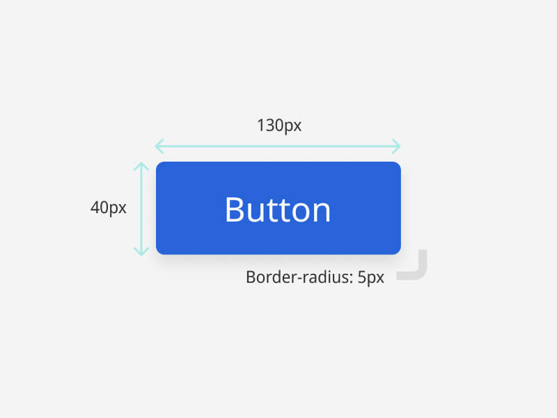
Height: 40px
Padding: 5px 15px
Text size: 14px
Border radius: 5px
Filled Buttons
Secondary: #01CFC8
Danger: #E83737
Outline Buttons
Secondary: #01CFC8
Danger: #E83737
Default: #C3C3C3 & #000000
Sample Code
<!-- Filled Buttons -->
<button type="button" class="btn btn-primary">Primary</button>
<button type="button" class="btn btn-info">Info</button>
<button type="button" class="btn btn-danger">Danger</button>
<button type="button" class="btn btn-secondary">Secondary</button>

<!-- Outline Buttons -->
<button type="button" class="btn btn-outline-primary">Primary</button>
<button type="button" class="btn btn-outline-info">Info</button>
<button type="button" class="btn btn-outline-danger">Danger</button>
<button type="button" class="btn btn-default">Default</button>
Learn more about Bootstrap Button
Card
Basic Style
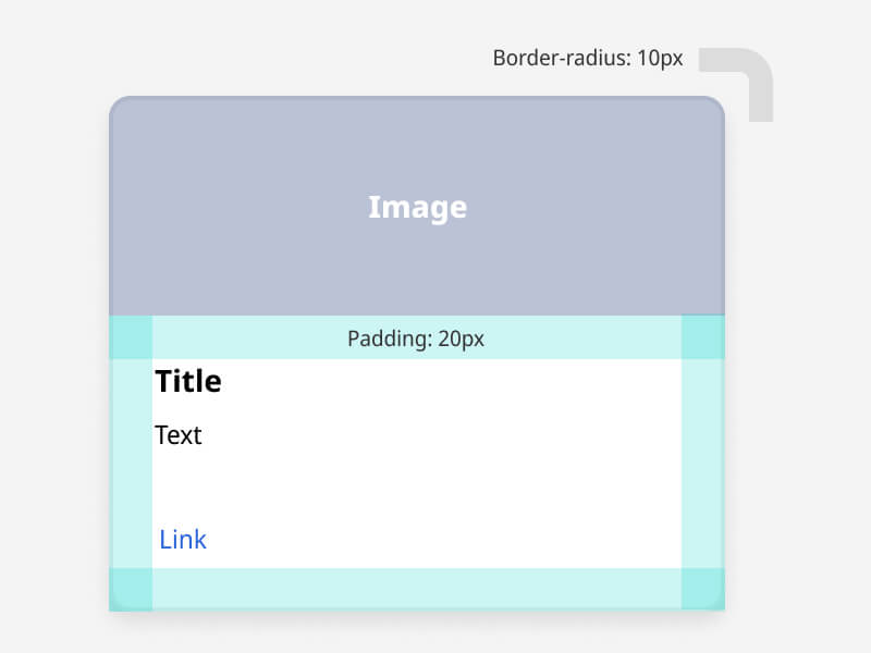
Backgorund: #FFFFFF
Padding: 20px
Box shadow: 0px 5px 10px rgba(0, 0, 0, 0.1)
Text color: #000000
Title size: 18px
Text size: 16px
Link: #2863D8
Vertical Card
Used in news list
Sample Code
<div class="card card-news">
    <div class="pic" style="background-image: url('https://placehold.co/500x215');"></div>
    <div class="con">
        <div class="date">10/01/2024-10/17/2024</div>
        <div class="title">Title</div>
        <div class="text">Text</div>
        <div class="link">Read more...</div>
    </div>
</div>
Horizontal Card
Used in news list
Sample Code
<div class="card card-news card-news-md">
    <div class="inner">
        <div class="con">
            <div class="title">Title</div>
            <div class="text">Text</div>
        </div>
        <div class="pic" style="background-image: url('https://placehold.co/500x215');"></div>
    </div>
</div>
Resource Card
Used in resource list
- # Tag
Sample Code
<div class="card card-resource">
    <div class="card-header">
        <div class="title">Title</div>
        <div class="date">Last update:10/01/2024</div>
    </div>
    <div class="card-content">
        <div class="item">
            <div class="title">Date:</div>
            <div class="text">10/01/2024-10/17/2024</div>
        </div>
        <div class="item">
            <div class="title">SIG Category:</div>
            <ul class="list-tag">
                <li># Tag</li>
            </ul>
        </div>
        <div class="item">Resource Type:Type Name</div>
        <span class="text-orange">Detail</span>
    </div>
</div>
Application Card
Used in member center application list
Sample Code
<div class="card card-product">
    <div class="card-body">
        <span class="badge bg-success">Online</span>
        <div class="title">Title</div>
        <div class="text">SIG Category:Smart Automotive</div>
        <div class="date">Latest Update:2024-11-01</div>
    </div>
    <div class="card-footer">
        <a href="#" class="btn btn-sm btn-default">Edit</a>
        <button type="button" class="btn btn-sm btn-primary">Submit</button>
    </div>
</div>
Gradient Effect Card
Cards used to emphasize specific content. For example, ICT market place page.
Backgorund: #FFFFFF
Padding: 50px
Box shadow: 0px 5px 10px rgba(0, 0, 0, 0.1)
Text color: #000000
Title size: 30px
Sub title size: 18px
Text size: 16px
Gradient: 148deg, #01CFC8, #055FDD
Sample Code
<div class="service-item about-service-item specil text-left">
    <div class="specil">
        <div class="shape-1"></div>
        <h2 class="main-title">Title</h2>
        <h4 class="sub-title">Sub Title</h4>
        <div class="row text-center mt-3">
            <div class="col-4">
                <img src="https://placehold.co/100x100">
                <div class="service-content m-2">
                    <h3 class="title">Title</h3>
                    <p>Text</p>
                </div>
            </div>
            <div class="col-4">
                <img src="https://placehold.co/100x100">
                <div class="service-content m-2">
                    <h3 class="title">Title</h3>
                    <p>Text</p>
                </div>
            </div>
            <div class="col-4">
                <img src="https://placehold.co/100x100">
                <div class="service-content m-2">
                    <h3 class="title">Title</h3>
                    <p>Text</p>
                </div>
            </div>
        </div>
    </div>
</div>
Learn more about Bootstrap Card
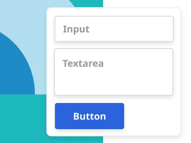
Form
Text color: #666666
Text color: #000000
Background: #FFFFFF
Border color: #C3C3C3
Text color: #000000
Background: rgba(#2863D8,0.1)
Border color: rgba(#2863D8,0.2)
Text color: #000000
Background: #2863D8
Border color: #C3C3C3
Sample Code
<!-- Input-->
<div class="form-group">
    <label>Input<span class="text-danger">*</span></label>
    <input type="text" class="form-control" placeholder="Please enter">
</div>

<!-- Select - Single -->
<div class="form-group">
    <label>Single select<span class="text-danger">*</span></label>
    <select class="form-control">
        <option>Chief Executive</option>
        <option>General Manager</option>
        <option>Sales Manager</option>
        <option>Engineering Manager</option>
        <option>Accountant</option>
    </select>
</div>

<!-- Select - Multiple -->
<div class="form-group">
    <label>Multiple select</label>
    <select class="form-control select2" multiple="multiple">
        <option selected>Read</option>
        <option selected>Music</option>
        <option>Food</option>
        <option>Run</option>
        <option>Swim</option>
    </select>
</div>

<!-- Textarea -->
<div class="form-group">
    <label>Textarea</label>
    <textarea rows="3" class="form-control" placeholder="Please enter"></textarea>
</div>

<!-- Checkbox -->
<div class="form-group">
    <label>Checkbox</label>
    <div class="form-check-custom">
        <input type="checkbox" checked>
        <div class="icon"></div>
        Option 1
    </div>
    <div class="form-check-custom">
        <input type="checkbox">
        <div class="icon"></div>
        Option 2
    </div>
    <div class="form-check-custom">
        <input type="checkbox">
        <div class="icon"></div>
        Option 3
    </div>
</div>

<!-- Radio -->
<div class="form-group">
    <label>Radio</label>
    <div class="form-radio-custom">
        <input type="radio" name="radio" checked>
        <div class="icon"></div>
        Option 1
    </div>
    <div class="form-radio-custom">
        <input type="radio" name="radio">
        <div class="icon"></div>
        Option 2
    </div>
    <div class="form-radio-custom">
        <input type="radio" name="radio">
        <div class="icon"></div>
        Option 3
    </div>
</div>
If you need to use multiple select, please add javascript code as follow:
Sample Code
/* Javascript */
/* Multiple Select */
$(function(){
    $('.select2').select2();
})
Learn more about Bootstrap Form & Multiple select plugin Select 2
Table
| Name | Tel | |
|---|---|---|
| Allen | allen@mail.com | +8860123456 |
| Ben | ben@mail.com | +8860123456 |
Text color: #000000
Title font weight: bold
Coloumn padding: 10px
Border color: #DEE2E6
Backgorund (Even Row): rgba(0, 0, 0, 0.05)
Sample Code
<div class="table-responsive">
    <table class="table table-bordered table-striped">
        <thead>
            <tr>
                <th>Name</th>
                <th>Email</th>
                <th>Tel</th>
            </tr>
        </thead>
        <tbody>
            <tr>
                <td>Allen</td>
                <td>allen@mail.com</td>
                <td>+8860123456</td>
            </tr>
            <tr>
                <td>Ben</td>
                <td>ben@mail.com</td>
                <td>+8860123456</td>
            </tr>
        </tbody>
    </table>
</div>
Learn more about Bootstrap Table
Carousel
Sample Code
<!-- HTML -->
<div class="owl-carousel owl-card">
    <div class="card card-news">
        <div class="pic" style="background-image: url('https://placehold.co/500x215');"></div>
        <div class="con">
            <div class="date">10/01/2024-10/17/2024</div>
            <div class="title">Smart Golf Cart enables innovative mobility service for country clubs</div>
            <div class="text">This Robotics Application Trends Seminar will delve into the latest developments and future trends in robotics technology, covering innovative applications in manufacturing……</div>
            <div class="link">Read more...</div>
        </div>
    </div>
    Card 2
    Card 3
    ..
</div>
Remember to add javascript code as follow:
Sample Code
/* Javascript */
$(function(){
    $('.owl-card').owlCarousel({
        items: 1,
        slideSpeed: 2000,
        nav: true,
        autoplay: false,
        dots: false,
        loop: true,
        responsiveRefreshRate: 200,
        navText: ['<img src="img/ic_arrow_prev.svg">', '<img src="img/ic_arrow_next.svg">'],
        responsive:{
        0:{
            items:1,
            nav:true
        },
        768:{
            items:3,
            nav:false
        }
        }
    })
})
Learn more about Owl Carousel
Modal
Background: #2863D8
Padding: 10px 15px
Background: #FFFFFF
Padding: 15px
Sample Code
<!-- <a> Trigger Modal -->
<a href="#modal_sample" class="btn btn-primary" data-bs-toggle="modal"></a>

<!-- <button> Trigger Modal -->
<button type="button" class="btn btn-primary" data-bs-toggle="modal" data-bs-target="#modal_sample" ></button>

<!-- Modal Start -->
<div class="modal fade" tabindex="-1" id="modal_sample">
    <div class="modal-dialog modal-dialog-centered">
        <div class="modal-content">
            <div class="modal-header bg-primary">
                <h4 class="modal-title text-white">Modal title</h4>
                <button type="button" class="btn-close btn-close-white" data-bs-dismiss="modal" aria-label="Close"></button>
            </div>
            <div class="modal-body">
                Modal body text goes here.
            </div>
            <div class="modal-footer">
                <button type="button" class="btn btn-sm btn-default" data-bs-dismiss="modal">Close</button>
                <button type="button" class="btn btn-sm btn-primary">Save</button>
            </div>
        </div>
    </div>
</div>
<!-- Modal End -->
Learn more about Bootstrap Modal